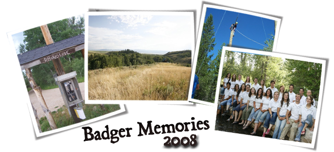
I'm sure many of you have felt the desire to help it out. I have felt that many times and thought that when I am rich, I will do likewise. But the fact is that we all have helped Badger by giving it our talents and time. I have been given an opportunity to help with mine. I hope that you can with yours as well as follows.
Badger Creek is an eve evolving entity. So has it's appearance been. It doesn't have a solid visual identity. Below are some examples of logos. I need your help to determine what you guys feel about the direction of them. As you can imagine, creating a symbol for a symbol of something so great in the history of our lives is daunting. I don't want to create something lacking that is attributed to me but rather something cool that is attributed to us.
IMPORTANT NOTE: These are IDEAS. Meaning some are more refined then others. So their finished product gives them a nicer feel. All will be finished with a nicer feel, but right now the most important thing is the simple form-the unifying element. There may be a number of logos (a mother one for Badger, one fore OYA, Quest, etc.) but even though they may be different, they will have a similar unifying element. These are just ideas, starting places. The borders, boxes etc. can all be changed around. There will be different versions. For example, a detailed ornate one for a plaque, another for a letter head, simpler for shirts. Should the staff coats have a different logo then the program title? Or maybe I'm missing an idea all together. Please give me your input and ideas in any and all aspects. Thank you so much and I hope that life is finding EVERY one of you well. I miss and love you guys.
JP


JP,
ReplyDeleteI like the looks of the Badgers in the top of the first box, especially when added to the BC and Badger Creek in the bottom box. I also like the idea of the Tetons in the middle box. I'd like to see them in other colors though because the ones you have just don't seem right.
Dearest JP...
ReplyDeleteFirst of all, I think this is awesome that you are doing this. See a need...fill it. love.
Anyways, I find myself more drawn to the second box. I think it is smart to highlight the Tetons because they are such a recognizable landmark. With the first box, it took me a while to figure out what it was (maybe that's cuz I'm special). So naturally I feel like others might not catch on as well.
I understand that these are "rough" but well done friend. If I have any brainstorms, I'll share...
I really like the idea of having the Tetons in the logo, of course--who wouldn't want those gorgeous mountains in a logo?
ReplyDeleteI liked the feel/idea of the Tetons with the badger in the first box the best, I think; however, I also liked the "Badger Creek" labeled one and the "BC" one in the last box.
Those were my favorites--like the badger, LOVE the Tetons. :)
You are doing a great job--I can't wait to see the final work of art...I know it will be amazing!
-Rachel